Sonntag, 1. Mai 2016

Torch-Trek

I'm not actively following it, but I still learned about Star Trek: Axanar, which is a fan-production who could possibly shake things up a bit.
Now on the first look, I really liked Axanar, because it took up the recent (09, into darkness etc) look of trek rather than reminiscing in a perpetual state of nostalgia.

Before I go on, I should state my personal position on Trek in general - just to avoid confusion.
I really love the original series, it's design and it's narrative. I can also get along with parts of Enterprise, and I am a big fan of Armadillo-trek aka. the Starfleet Universe, also I really love the design of the recent Movies (I also dig Andromeda, and hang around on the Atomic Rockets far too much but that's probably a different story). 
Meanwhile, you probably guessed where this is going - I couldn't care less about TNG (and it's ridiculous 90s plot-devices) and everything that's further up the timeline. Most of it feels like bad fanfiction to me - something I blame on later series being written by fans of the original rather than by real science fiction authors. If you ask me, it shows. A lot.

Now Axanar would be a great step, that's making the overly dogmatic and entrenched fanbase accept parts of the 'new' timeline, also it has got great production values. This - unfortunately - is where main main caveat with the movie comes in.

It's a war-movie.

A Star Trek war-movie.

To make matters worse, it's defended by fans, that - in the same sentence - like to claim that the recent movies don't follow Gene Roddenberry's vision. 

It's a damn Star Trek war-movie.

I haven't heard of anything in trek, further from - what you could call Gene Roddenberry's vision.
Now, while I'm essentially ok with the Idea of a Trek war-movie (I like Armadillotrek, I am already one of the violent ones.), this example shows how broken Trek-Fandom is.

Personally, my main problem is more that the trailer also reveals another time-travelling 90s design from the late 24th century showing up and essentially saving the day. (ok, it's probably more the Constitution class to do that, but at that point I'd just rambling)

This puts me in a tight spot - there's stuff out there, I want to be great, and I want to like, but it all got fanbases attached to it, that are so full of dogma that no constructive discussion is to be had on any related topic. (also my convention-experiences thought me that your regular Trekkie is a rather poor example of a science fiction fan.)


Now complaining without offering a solution always is a bad thing, so here is my offer:

Start over. Not from TOS, but from the Forbidden Planet (which I see as the real basis). This is my personal introduction to a little experiment in Design and "creative" writing.
This is no simple fanfic, I'm planning on re-inventing the wheel. Of course everyone is invited to do the same.

Just pick your source material, and of you go.

[ A link to the project should appear here. ]

Montag, 28. September 2015

Using Matcaps in Blender to mimic traditional Materials.


I have - on occasion - been trying to mimic the look of traditional-art materials in Blender, starting with Nyrath's post on Deviantart, which in turn inspired me to try out different solutions and compare them to each other.

Of course this status-quo didn't hold up, and I saw this post some time later. I wanted to react, using my own creation, but none of the results were holding up.

Now construction individual Node-setups would require a lot of work, and also one would need to create a unique setup for most techniques, if not more for different angles and light setups.
The whole thing fell quiet for a while until I recently became obsessed with learning to use watercolour, mainly because of my dissatisfaction with the tools available to me.  That's where I had my little eureka Captain Obvious moment.

When you try to learn to paint, you usually - at some point - start to paint shaded spheres, because it sort-of never looks right. Now in CG we have something astonishingly similar, namely: Matcaps.

Embarrassed, that I didn't think of this solution earlier, I started to draw and paint different shaded Spheres, feverishly scanning them, to try out my solution, and here it is.

Regularly, you use your Matcaps shadeless, since the point about them is that they provide their own kind of shading. On a side-note, I really love that they still raytrace correctly and have intact shadows and reflections (because why shouldn't it?).


This has some Merit as in it doesn't need an awful lot of Rendertime. While it produces some nice (quick and dirty) results, I'm not really satisfied, but I can see me using them.

I usually like to render some additional shading onto my Matcaps to make them look less artificial, which produces some interesting results. Using the shaded Ball as inverted Normal/Bump-map adds a nice effect too.


That's where I started to remember the Movie "What dreams may come", which had some great art direction. There is a passage, in which the protagonist arrives in one of the Paintings of his dead wife, where - consistently - everything is made out of Paint (As far as 1998's special-effects take you anyway). Still it's kind of awesome work, and a big part of it easily stands the test of time. Also It's a Robin Williams movie.
This, and the fact that I really like Subsurface scattering, led me to liberally applying said technique to the Materials, to make the Suzannes in my scene appear less solid. (Now that I think of it, there's also a remarkably similar scene in "Hook", he seems to have had a thing for eating paint…)


I like that result, also it had a rather nice effect on the Ink-Suzanne as well.

Now there seems only one question left - Is this useful in animation? This of course largely depends, and I doubt that there is a lot of 'real' watercolour animation out there (forgive my ignorance, everything is out there, but not particularly what I meant), but it might have a lot of inconsistency on a frame-by-frame basis, but of course they could be baked.

Since this has to be tried out for completeness sake, I decided to render some short camera-flybys of my demo scene with shadeless and SSS Suzannes, just to find out what it would be like.


I still have to try this with fluids - I particularly imagine this effect great with soft-particle fluids and high viscosity (also I think that fluids that behave like paint, but look painted rather than paint are sort-of a funny concept). Time will tell how this Idea holds up. It's probably also worth mentioning that this works in Blender's game engine as well (and is not very resource-hungry, especially when shadeless, although one could use fake-SSS).

My overall conclusion is, that this is a potentially nice technique, and should be applicable to anything you can do on paper, or even in your favourite Image editing program. Still it doesn't beat that magnificent ink-shader.

Samstag, 8. August 2015

Fantasy Map generation - bottom to top - Part 2 - What and where?

Now that I have an Idea of what the landscape looks like, I am about to set a couple of rules.


  1. the darker a part of the map is, the steeper it is.
  2. one pixel should be around 5km, making the whole map 8000km wide - big enough to fit Germany right beneath the right-angle river, or the single island in the south about the size of Sicily, also scaling sailing-distances where the 'continents' are closest to Mediterranean levels. This should make for a Adventure-friendly environment, even if Ancient Greece-style Triremes are the state of the art. This should be enough for any Antiquity to Medieval style setting.
  3. the red parts contain a special kind of flora and fauna that is somewhat different to the rest of the world's baseline. Survival in the other 'zone' is difficult but not impossible. (like war of the worlds terraforming)
  4. the bright yellow parts have a more surreal atmosphere, and contain strange poisonous flora. Life venturing there must bring it's own supplies or starve.
  5. All lakes enclosed by land are fresh-water, everything else is salty. Water that is enclosed by the 'red zone' isn't salty, but slightly acidic. (as in it could be drunk, but outsiders would get heartburn in the short term, and would not really be able to sustain themselves on it without complications.

Now that that's established, I head over to the Seventh Sanctum, and hit the fantasy race generator once, and pick what I like. Regularly, one could skip this step, and just assume baseline Human everywhere, but I'd like some variation - also different creatures have different needs and mindsets - which should be reflected in a fantasy-map.
If you're here just for the mapmapking, you might want to skip this.
  • The race of gnomes. They are white-skinned and have red eyes. They have a rich culture. They worship a single god who works via assorted servants and messengers. They control an impoverished ocean kingdom that is the site of a lost civilization.
  • The race of Ogres. They change genders as they age. They produce great warriors. They avoid all kinds of magic except summoning magic. The god that created them in turn abandoned them.
  • The misshapen race. They are pale-skinned and have strange ears. They naturally hybernate. They are an all-male race. They control an island chain. A great doom awaits them, and they know it not. If they are all male, I can imagine what doom awaited them.
  • The race of raccoon-people. They have a rich culture. They practice some forms of spiritual discipline, but some would debate if it is an actual religion. They are intimately connected to an important prophecy.
  • The race of evolved mice. In their culture, code-breaking is a highly prized ability. They are exceptionally good at light magic. They existed only as slaves, but most won their freedom in revolt against their masters. Their history is unknown even to them.
  • The race of elves. They are yellow-skinned and have red eyes. They have perfect memories. The only kind of magic they can do is air magic. Their gods are said to be dead or have fled this world. They have no country of their own, but work for other races. since we want nations.
  • The race of elves. They are orange-haired and have gold eyes. They can change genders under certain conditions. They can see in the dark. They are exceptionally good at flesh magic. They are in general, atheists. They control a desert country. They came from another dimension.
  • The gigantic race. They are yellow-armored and have three arms. They interbreed easily with other species. They take naturally to mountain ranges. They are well-known for their postal system and dangerous poisons. They turned their back on their old gods to follow stranger ones. Their government is extremely corrupt.
  • The race of Griffin-people. They are genderless, and are able to reproduce on their own. They are well-known for their canals. They were created as part of a breeding experiment that went horribly wrong.
  • The race of evolved weasels. Their magical practices tend to focus on divine magic. They are very lazy. They have no defining religion, preferring to pick and choose from the pieces of other religions. They are the descendents of another race.

Now let's place them.

The Genderless Griffin-people have a thing for canals…wouldn't that go really well with a prominent Landmark we have. Depending on how over-the top we want them, they could have built the giant canal… or maybe their ancestors did.

Our evolved mice could live nearby, since they are ex-slaves (someone must have dug those canals) - also they are mice and codebreakers, so they might be heavily into numbers and very sneaky - I'd add some around there, using the canal itself and the red zone as protection against their former masters.

Our gigantic yellow friends also have an Ideal place for them - that mountainous island, I'm sure everybody else would hate.

Now, the ocean kingdom of that white-skinned goblins should be easy to place too. How about here:

The races we have left now have no location descriptions for them, so I assign them to other random criteria.

Flesh magic sounds like something, lots of 'regular' people would find disturbing, conditional gender-changing also doesn't sound regular, and we have no red-zone inhabitants yet, so our Orange-haired 'elves' go in a red zone, preferably further away from already placed settlements.

While we're at placing elves, the more 'regular' yellow ones should go somewhere too. I tend to just say that they are still somehow related, so let's place them closer.

Now, all that we have left are gender-changing Ogres, Raccoons and Weasels, and we still have a whole 'continent' left, so placing them should not be that hard.


I'd make the warrior Ogres red-zone guys too, so we have at least one more of them. therefore, I need to place them here

Which leaves the remaining landmass to our two rodent-species, I'd place them here:

And here:
Now that that's taken care of, let's go to…

The political map

I placed good visible dots where I assigned the 'starting locations' of the different races/factions, and took a big brush with a high falloff and 50% opacity, and clicked on every point a couple of times. What we get is a good picture of where the early (potential) conflict zones are.
Since I placed the first two factions very close together, I drew the border along the obvious lines - borders of red-zones, elevations, coastlines and rivers.


Same goes for our Elves and warrior Ogres -
 As for our two rodent-species, they do not manage to keep their respective lakes from each other (allowing for lots of piracy and naval incursions … because adventure-friendly), also they clearly fought for every single hill in previous conflicts.

Now there are two factions that could expand unhindered - at least as long as they hit resistance, creating additional borders for our yellow-giant friends
For our seagoing Gnome-pirates (Arr), I imagined Viking style expansion, combined with no real enemy to concentrate on, I gave them lots of small islands they could probably reach, and quite some colonies at remote and shallow shorelines. - this is what we end up with.
Or even better:
From here it could go either way… I'd find it likely that our sailor-gnomes' outposts would probably be hard to control centralized, and turn into their own little respective kingdoms, our corrupt yellow giants could use their strengths, and easy interbreedability to their advantage, and hire out 'mercenaries' to the other factions, while keeping to their home-landmass. If we would like our Griffon-people to have a bigger empire, the Mouse-kingdom could be pushed back to the atoll in the east, their shared islands could form their own little kingdoms with the other factions instead of fighting them. Also the green-zone elves could severely pushed back by their neighbouring factions.

The sweet part is, that the map does a great deal of storytelling on it's own.

Fantasy Map generation, bottom to top. Part 1

I've seen this tutorial by shmorkin, and instantly ran into trouble. If I was doing a fantasy-map, sooner or later, I'd like to have a good topology map, which can be done with the use of some simple steps and filters in GIMP, but then I'd have nation borders that wouldn't make sense, or I would have to indulge into a copy&paste orgy, just to make that mountain pass follow the border. Also I usually don't write tutorials.


Now since realistic is such a bad word in fantasy (your deserts are in the wrong places, also how is that sea of fire affecting the overall climate?), I'd suggest we want believable maps. 
Also Political borders mostly tell lots of little stories, something that will argument your writing-project a lot, when done right.


Before I start to explain my workflow, I want to add, that I'm using the GIMP, version 2.9.1 which I grabbed from git-hub and compiled myself… so my version might behave different from yours..

I usually start with generating topography by using 
Filters → Render → Noise → Plasma
this is also the point where I tend to throw interesting textures I found in the image, in the hope of being able to use some parts of it.I used one from this page just for demonstration purposes. Also this is highly optional - the plasma will provide a good basis, but you will notice that the map patterns tend to be rather monotone after a while. I overlapped the texture with Burn to preserve the grain of the plasma.
After that, merged the two layers (I tend to use the new from visible option, but merge should be fine too), and used
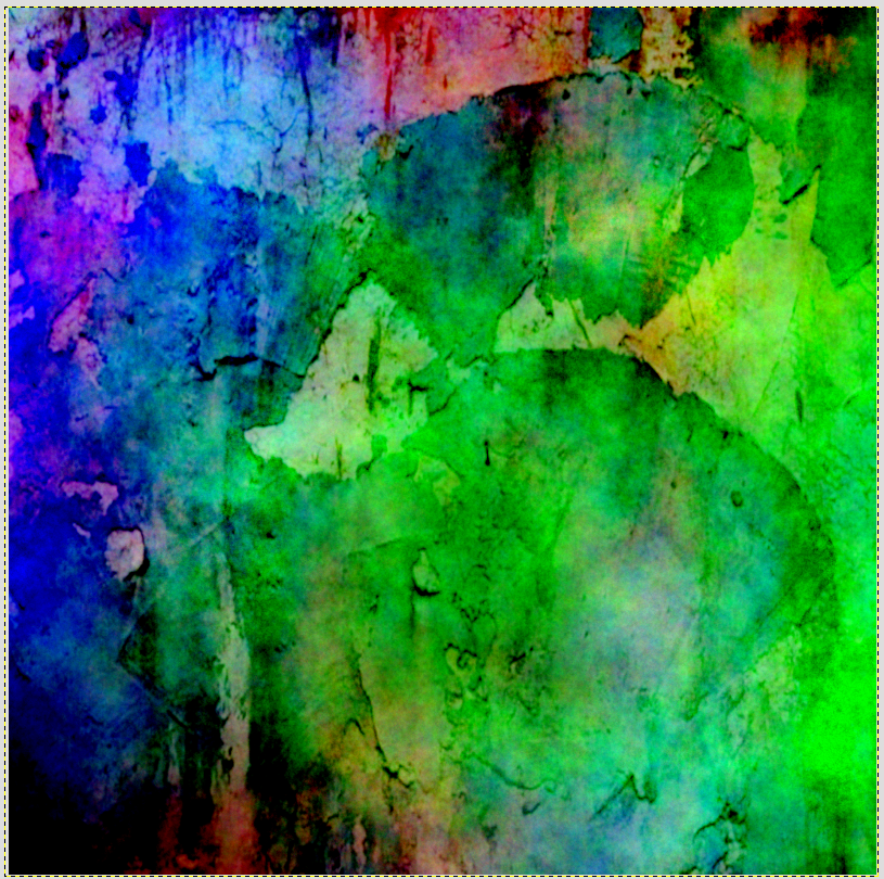
Filters → Render → Noise → Difference Clouds
what could work on it's own, but this way, it preserves some information from the previously used pictures. In the result, you can already see hints of landmass and sea, also there are some potentially interesting features, we probably could reinforce before the next step.
I took a copy of the new layer and ran 
Colours → Desaturate 
on it, to get a feeling of where the low and high parts would be, and I liked the resulting images, so I kept them for later.


After that I ran the - in my opinion - most important tool for this
Distorts → Emboss
This is where you get to define if your map is a Lunar crater-landscape, or a group of islands with hills and lakes. Now my first try resultet in something that looked like a post-apocalyptic desert to me, so I added one of the previous desaturated images onto it (again via Burn, since it's messiness tends to create additional artefacts - we want lots of artefacts for our map). If I hadn't kept some of the desaturation-results from above, I could have run Difference Clouds again, followed by Emboss. After getting a feel for how Emboss works, one could also paint certain features by Hand. After looking at my result for some time, I decided to run Difference Clouds on a copy from visible anyway, and overlay it to the older Image - in this case with Darken Only, because It looked better than the other options.

At this point, we could be proceeding with adding more effects, more Noise, until we get the result we want, also if none of them are satisfying, raising contrast and/or blurring - followed by newly embossing. It might also be a good Idea to apply low-opacity paintstrokes to undesired regions. After all that, I usually run 
Colors → Auto → White Balance
to lighten the image up a bit for the next step.
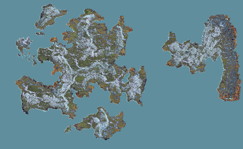
Looking at this Image makes me want to add some craters, and turn it into a rather desolate landscape, but for the purpose of this tutorial, we want more limiting terrain features, and therefore a coastline. I decided to start with the lighter part on the left, that already looked like water.
This step mainly consists of manually drawing edges with the Free Select Tool, following the generated terrain-features to get a 'believable' look. Also I made a new layer for every shape I drew here.


Since I am lazy, I clicked the rest of the land together using the Scissor Selection Tool, which is a lot faster, but provides far less detailed results. I also added some mall islands to the coasts of the bigger landmasses.

The whole thing was somewhat tightly packed, also It's good visible where I ran out of motivation, so I decided to crop the whole map, and turned it 90° clockwise to get a good format again. (the original image was 1600*1600, now it's 1600*1000)
Now let's take a look of the terrain we are going to work with. For this I merged all the black outline layers together, selected them with the Select by Colour Tool, and cut their shapes out of the white placeholder layer, I used as a background.
Of course one could do this the other way around, but I find it easier to review the final landmasses before moving on.
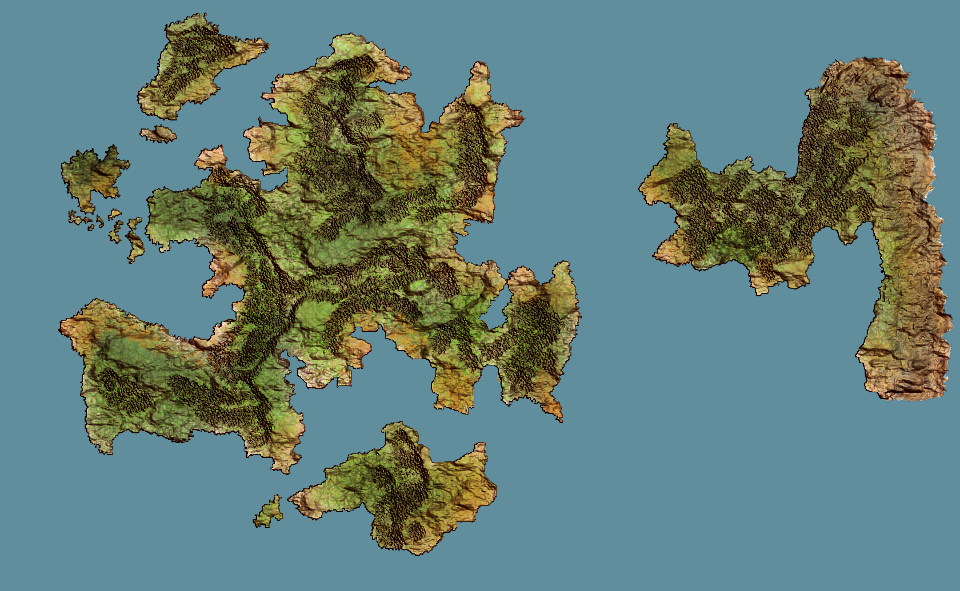
Next, I'm checking the texture for things that should rather be sea, as well as some weird landmarks, like the two canyons, meeting at a right angle on the upper left landmass.
After that, I take the last image that had colours and overlay it with the effect that looks most pleasing - in my case it's Grain extract. I deactivate the white layer and generate a new layer from visible, and adjust it's colours with Hue-Saturation until it's all shades of brown and green. I added some patches of red for a slightly surreal fantasy element. I also cut some additional patches out of the white layer, because it looked like there would be some really interesting places.


 Now, there are still some white patches, and a lot of things to correct, but also there are a lot of terrain features that could potentially tell a story or two. (I also made some last minute color corrections)


Since this is getting really long, I'd prefer to make this a two-parter.

Next time I'm distributing resources and name terrain features, to get our initial population seed - the rest should happen automatically.